Shopify
Shopify • 2022
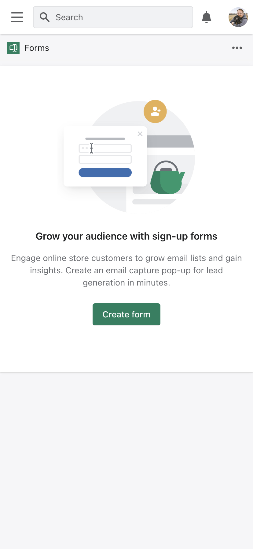
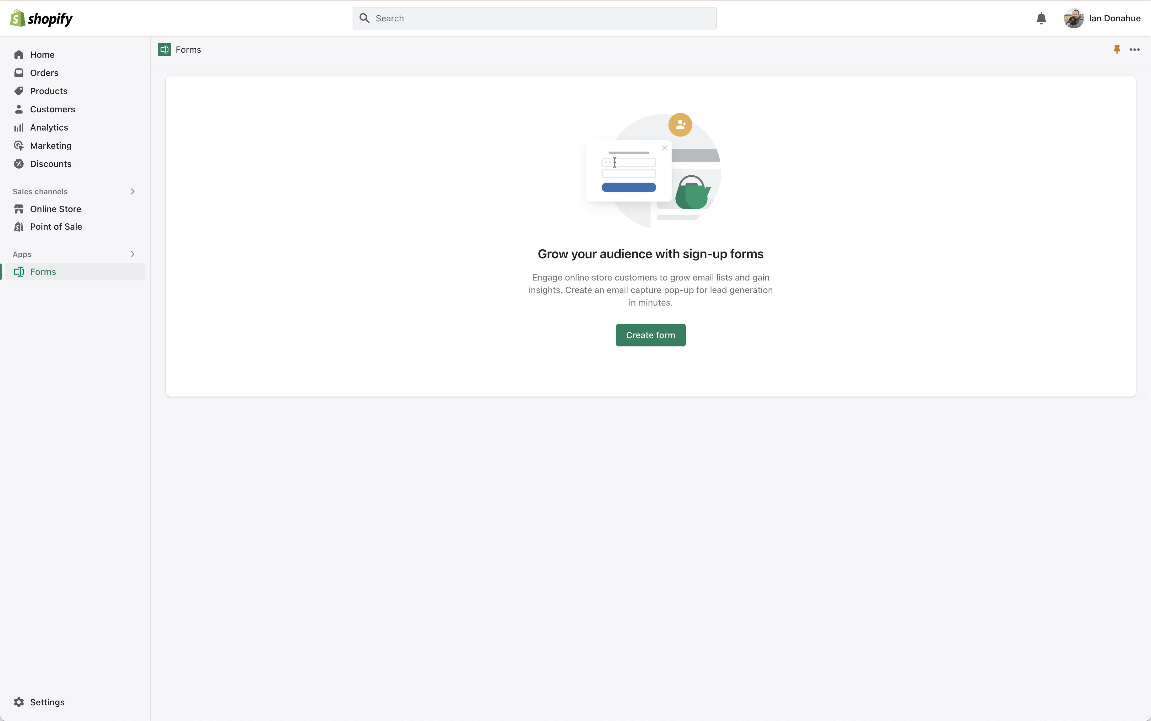
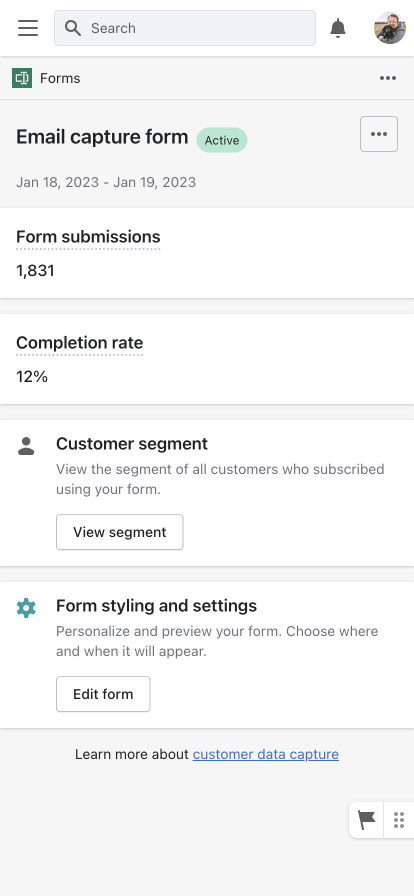
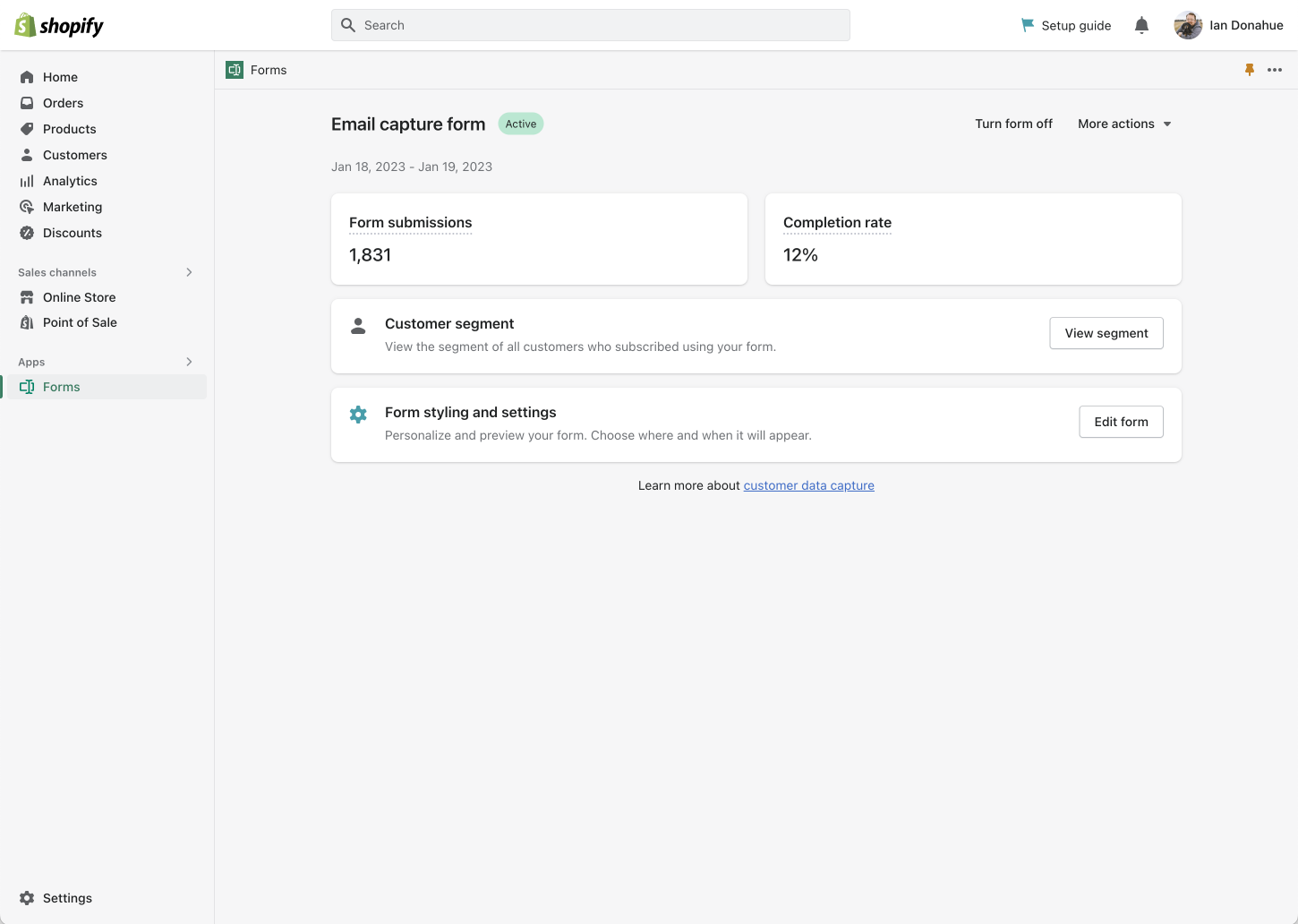
Shopify Forms
Shopify • 2022
About Shopify
Shopify powers millions of businesses worldwide. The all-in-one commerce platform to start, run, and grow a business.
Context
For small and medium merchants it is on of their hundreds of priorities. To make it easier for Shopify merchants, the on Shopify's App store can help. The app store has thousands of first part and third party solutions. But for marketing, these solutions are prohibitively expensive for many merchants.
Thankfully, Shopify offers our own first party apps for email marketing and automating their online stores. Shopify Forms is the last piece of the puzzle to enable merchants to have access to the features of much more expensive third party apps.
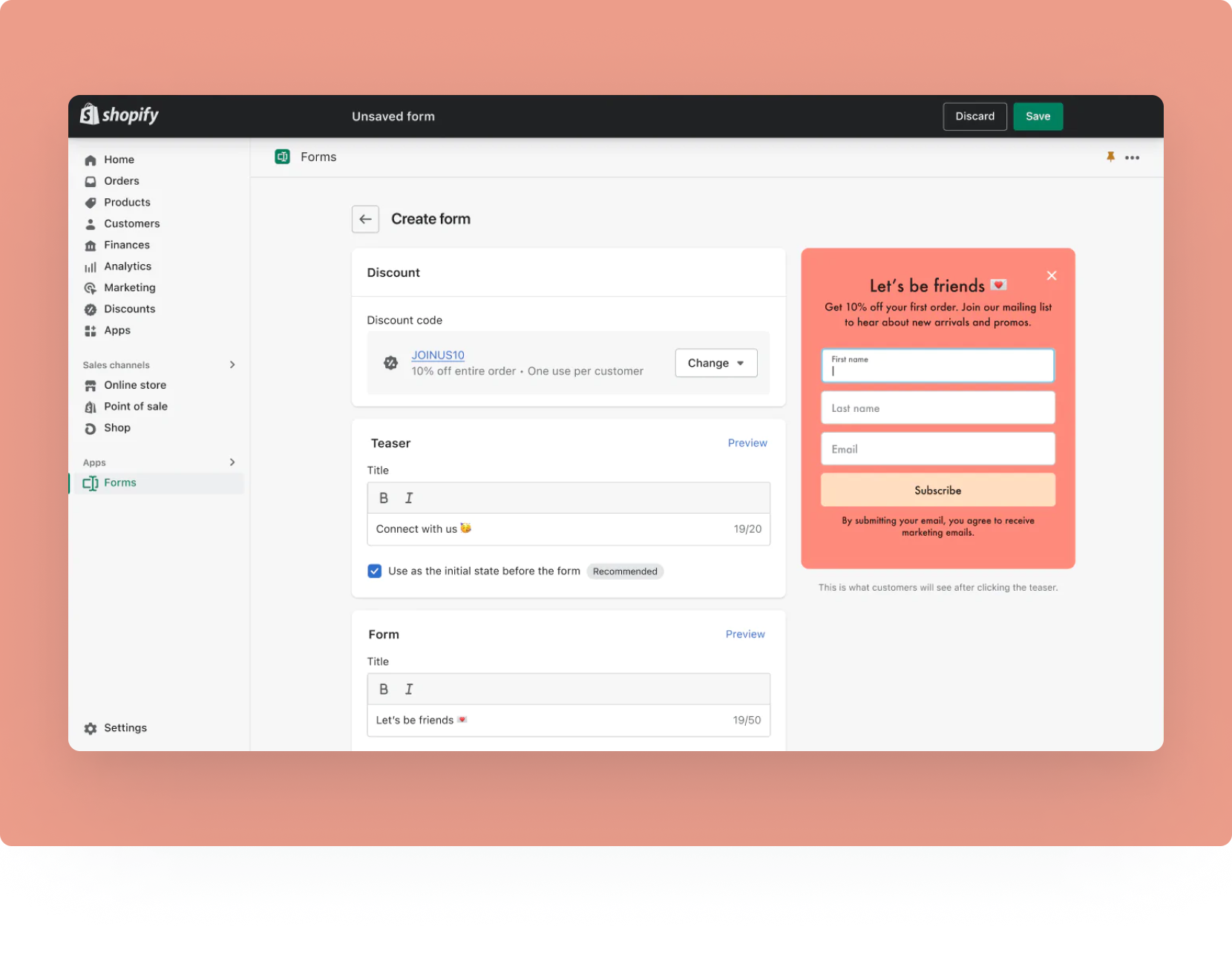
Shopify Form's goal is to offer a customizable form expereince that is the easiest, and best lead generation tool available to Shopify Merchants.
Audience
For our initial release, we designed the product to support merchants with 0 to 10,000 customer records. This would be a larger portion of Shopify’s merchants, but they may not be willing to pay for an expensive suit of marketing tools like Klaviyo, Seguno, etc.
My Role
Gather context
Competitive analysis: I researched how Merchants were currently creating a lead generation popup. The most common apps they used were Klayvio, Privy, Rivo, Seguno, POWR, Mailchimp and etc. After, I created a competitive analysis document with features. I then worked together with the product manager and engineers to prioritize them and how we wanted to integrate them into our release.
Internal context: Shopify is a big company with lots of teams and designers. It can be hard for one part of the company to know what others are doing. To fix this, I talked to designers on different teams to learn about their work and plans. I worked closely with a designer on the Shopify Email team to create unified solution that would feel familiar to Shopify Merchants when using Shopify Forms and Shopify Email.
Merchant interviews: Shopify is a big company with lots of teams and designers. It can be hard for one part of the company to know what others are doing. To fix this, I talked to designers on different teams to learn about their work and plans. I worked closely with a designer on the Shopify Email team to create unified solution that would feel familiar to Shopify Merchants when using Shopify Forms and Shopify Email.
Product thinking
I collaborated closely with the product manager and engineering team to understand user needs and set goals for our product. We held weekly meetings and follow-ups to plan and make sure everything stays on track.
Designing the merchant and buy experience
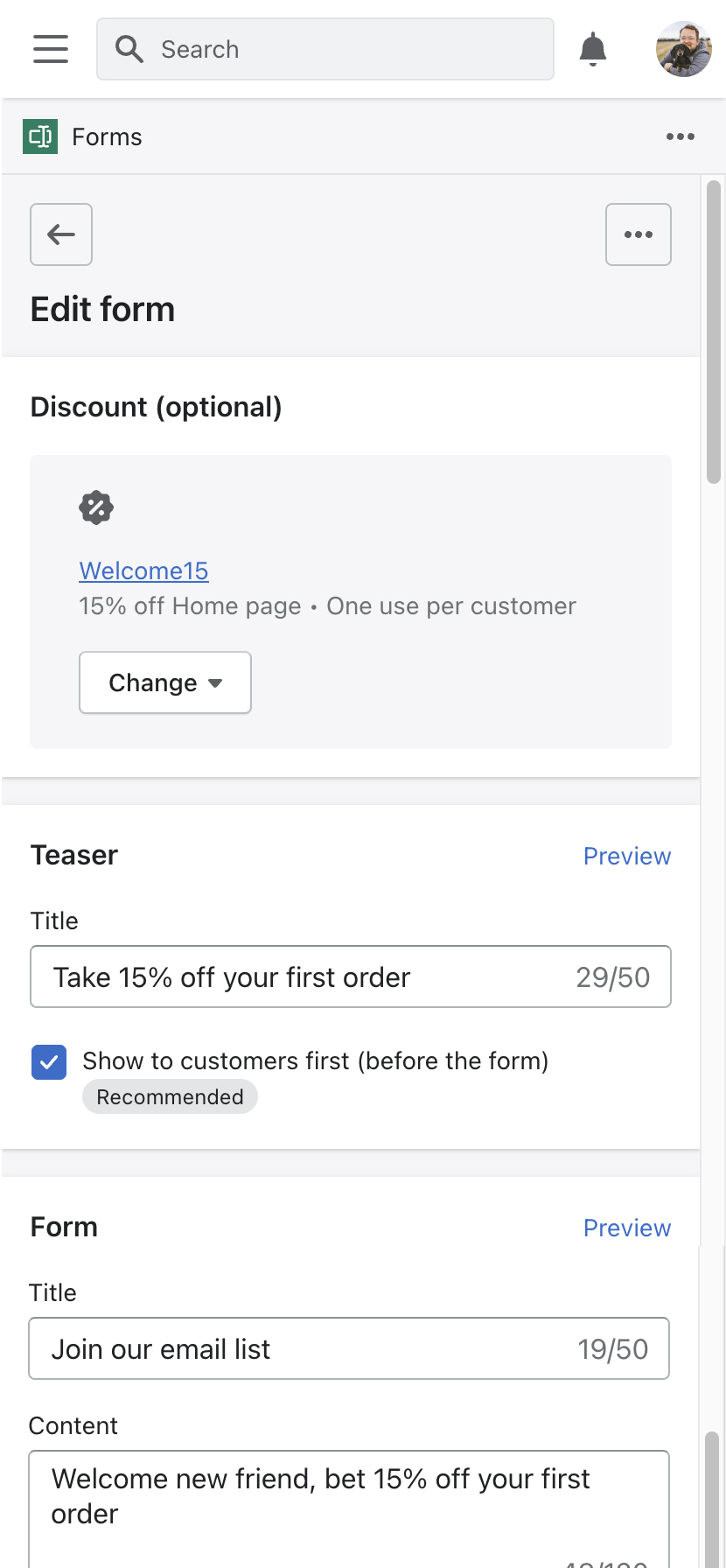
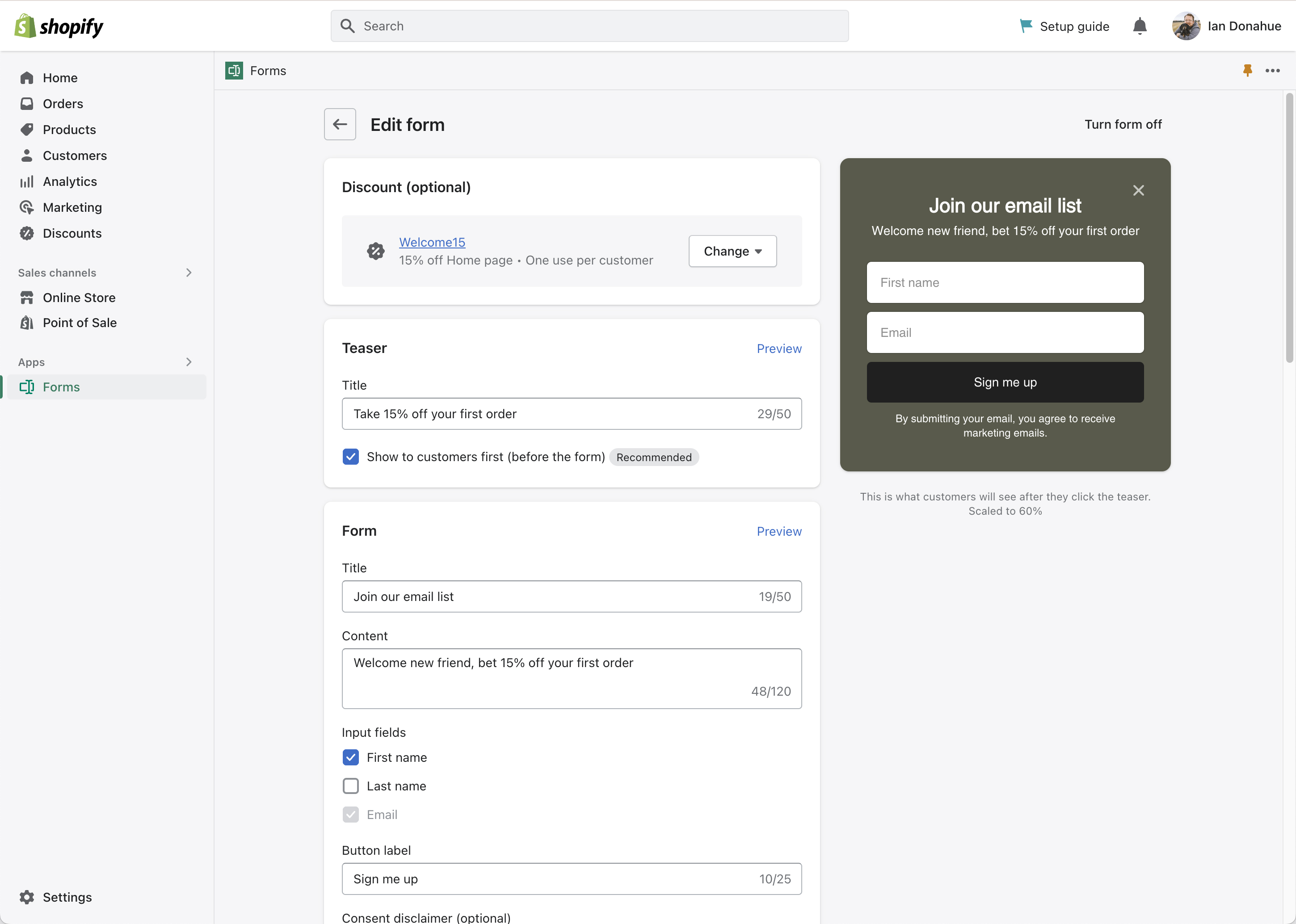
Merchant experience: Using design methods and lead co-creation workshops to fight complexity and break problems into an easy to use solution. I leveraged the UI using Polaris, Shopify’s design system as much as possible. This allowed us to solve basic UI problems with Polaris, but much of Shopify Forms required designing entirely new UX patterns.
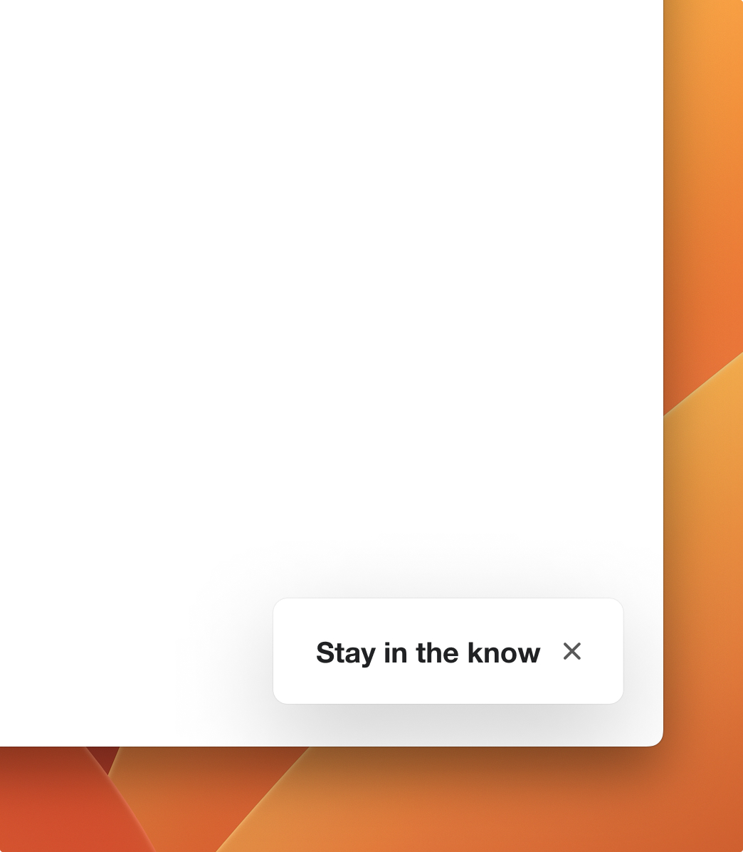
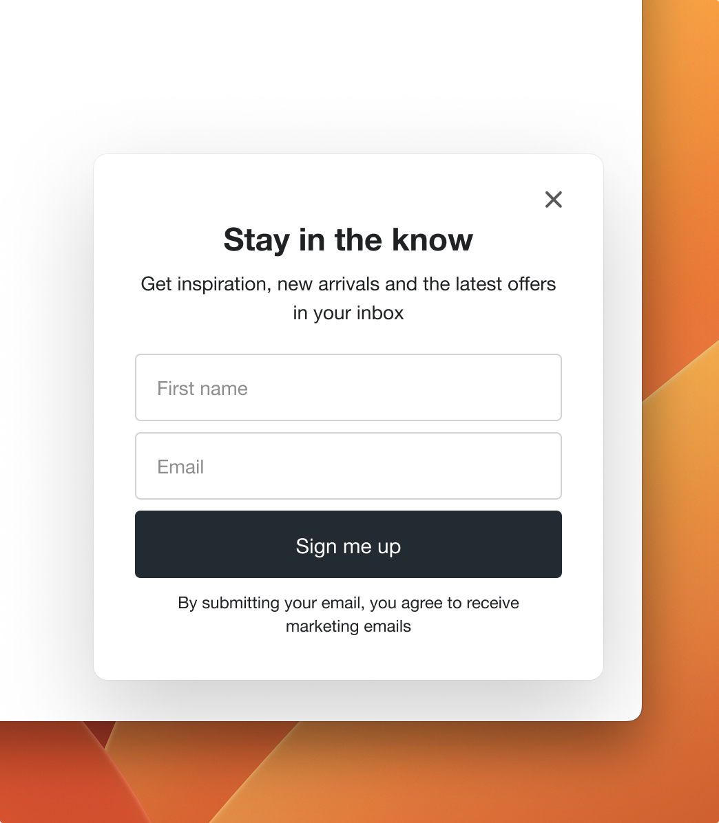
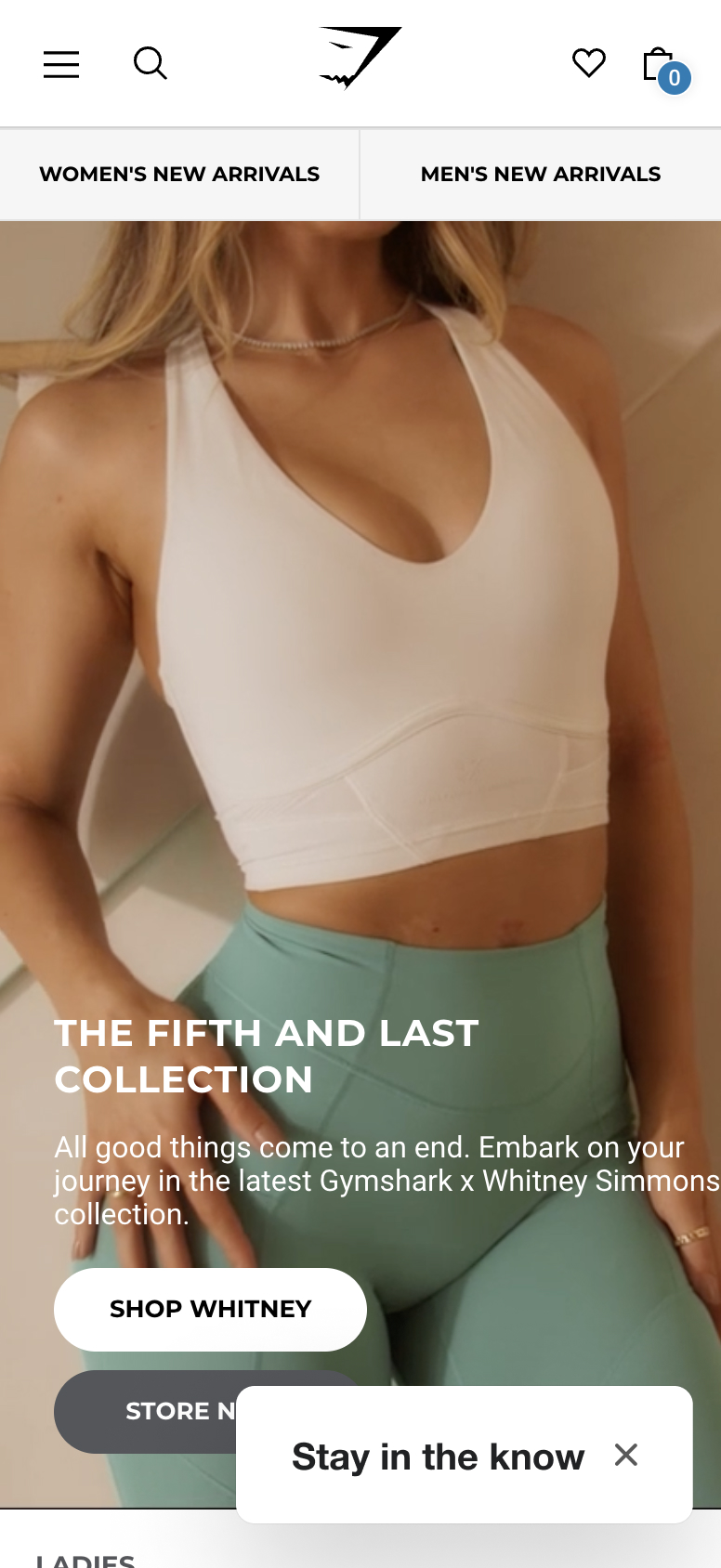
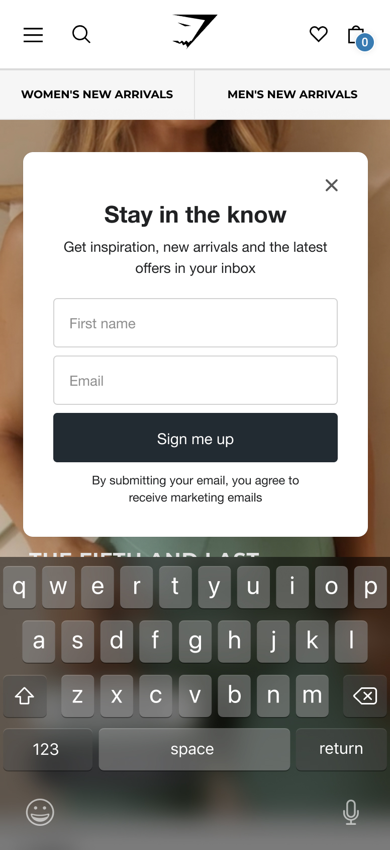
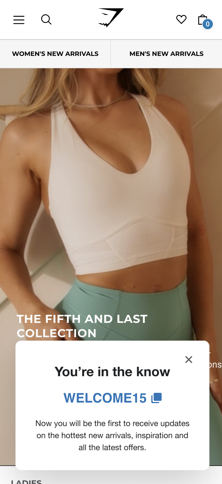
Buyer experience: Designed trustable popup that could work well on mobile and desktop. The buyer needs an easy to use, mobile friendly, assessable, fast and delightful popup form.
