Dave is a start-up Unicorn with over +10 million users. Dave is “Banking for Humans.” For $1-a-month, Dave offers users checking accounts with no minimums or overdraft fees; automated budgeting; cash advances of up to $100; and the ability to build up their credit scores

Dave • 2019
Dave • 2019
Dave has a start-up Unicorn with over +10 million users. Dave is “Banking for Humans.” For $1-a-month, Dave offers users checking accounts with no minimums or overdraft fees; automated budgeting; cash advances of up to $100; and the ability to build up their credit scores
Dave was introducing Dave Banking to all users. This required a unified Customer Support (CS) process, flow and workspace which didn’t exist. Many support tickets required 3rd party tools, multiple internal tools and wiki’s to help trouble shoot customer issues. It was common for a CS agent to have more than 10 browser windows open at any given time to assist a end user.
Furthermore, we needed to identify which support tasks could added to the mobile application.
Product designer tasked with creating a single, unified workspace for CS team members. It was one of those “One ring to rule them all” type situations. The product manager and I interviewed the CS team so we could design a workspace for them. Finally, to support the CS team, engineers, and product managers, it was important to create a design system that could scale.
After 6 months, the CS workspace v1.0 was released. The design system was implemented and the CS workspace was in full use. It was also now possible for product managers and engineers to work though feature tickets without needing every screen to be designed thanks to the new design system. I provided "design reviews" for new features but much of my time would continue by evaluating existing design system paradigms, gathering feedback from CS Agents, and solving new solutions to those pain points.
Product designer tasked with creating a single, unified workspace for CS team members. It was one of those “One ring to rule them all” type situations. The product manager and I interviewed the CS team so we could design a workspace for them. Finally, to support the CS team, engineers, and product managers, it was important to create a design system that could scale.
Due to NDA, there is very little I can share at this time. Here are some features that I explored while at Dave.
Implementation of the Dave Design System in the CS workspace. Designed to provide clear interactions and high level of usability. CS Design System were inspired to have similar interactions to the Dave mobile app.
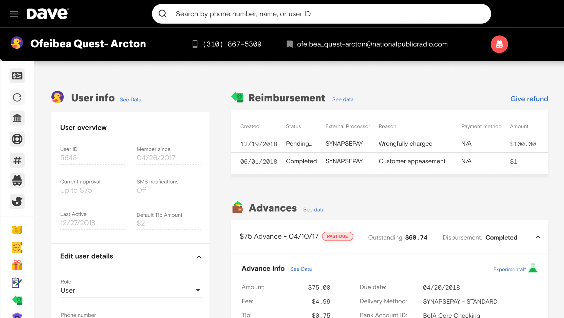
Tables get a bad rap! After user testing, it was discovered a well designed table communicated information more clearly than all other design explored.
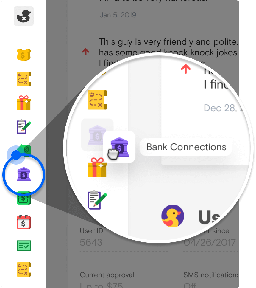
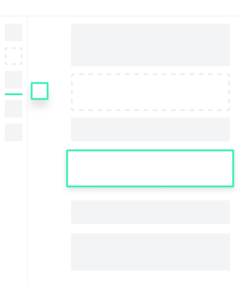
Quick navigation provides faster customer support. Clicking an icon jumps to the appropriate section of the page. Navigation icons can be re-organized and the pages content re-organizes to match.
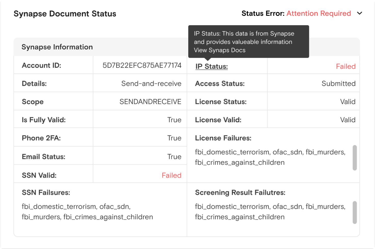
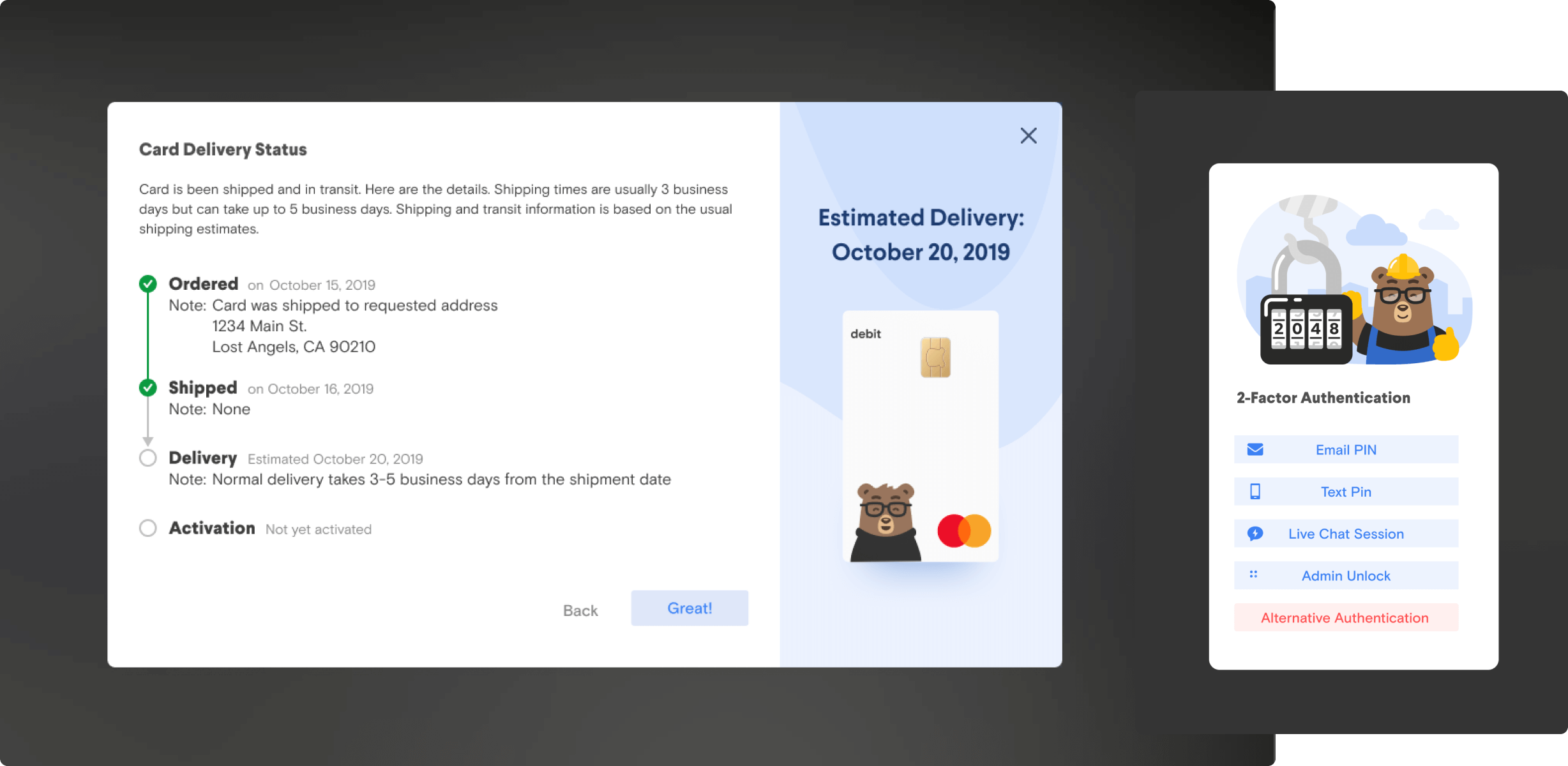
Modals show less frequently needed, but more detailed information. This include JSON objects, permission controls, warnings, etc. It was a goal to add a bit of “Dave” delight whenever possible.
That's it for now, the ride on the time machine has ended. Thank you for joining me, and I would love to chat.