Qunomedical
Qunomedical • 2020-2022
Die Anatomie
Qunomedical • 2020
Company
Qunomedical is a digital health platform that connects patients with doctors and hospitals worldwide and based in Berlin, Germany.
Background
Qunomedical had no design system or UI library whatsoever, which created a lot of inconsistencies across the user journey. Previous designers were creating and shipping designs without a source of truth. This added up to creating interfaces that had several different color and text styles, spacing, shadows and overall incongruent components.
I was charged with creating Qunomedical’s first design system. I had to audit the entire user journey, mapping all styles, spacings, treatments and components we were using, and create a system that was complete enough to recreate everything we had in production, but minimal enough to converge all these inconsistencies into less styles and components and document it so our designers, product managers, and engineering could use it.
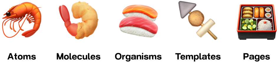
I've worked on and developed numerous design systems, but not from a company with some much legacy interfaces and experiences. I knew many of the best practices, but never built one that would be leveraged by multiple teams, developers or product managers. I leaned strongly into the Atomic Design Model of atoms, molecules, organisms, templates, pages and also best practices from companies like Shopify (Polaris Design System).
Problem
We lacked consistency and quality in our product. This was due to having a product worked on by many different designers in a fast-paced startup environment. These inconsistencies included wording, UI, colors, buttons, text styles, etc. Qunomedical lacked a single source of truth on how the product should, look, feel and make users feel when using our products.
Goals
- To make it easier for designers and developers to build products.
- Create a unified design system that reflects Qunomedical's brand, visual style and tone of voice.
- Deliver a reusable system of tokens, components, design patterns, icons, and documentation guidelines.
- Create documentation where everyone can find the official and foundational resources, principles, assets and other resources.
What did I inherit?
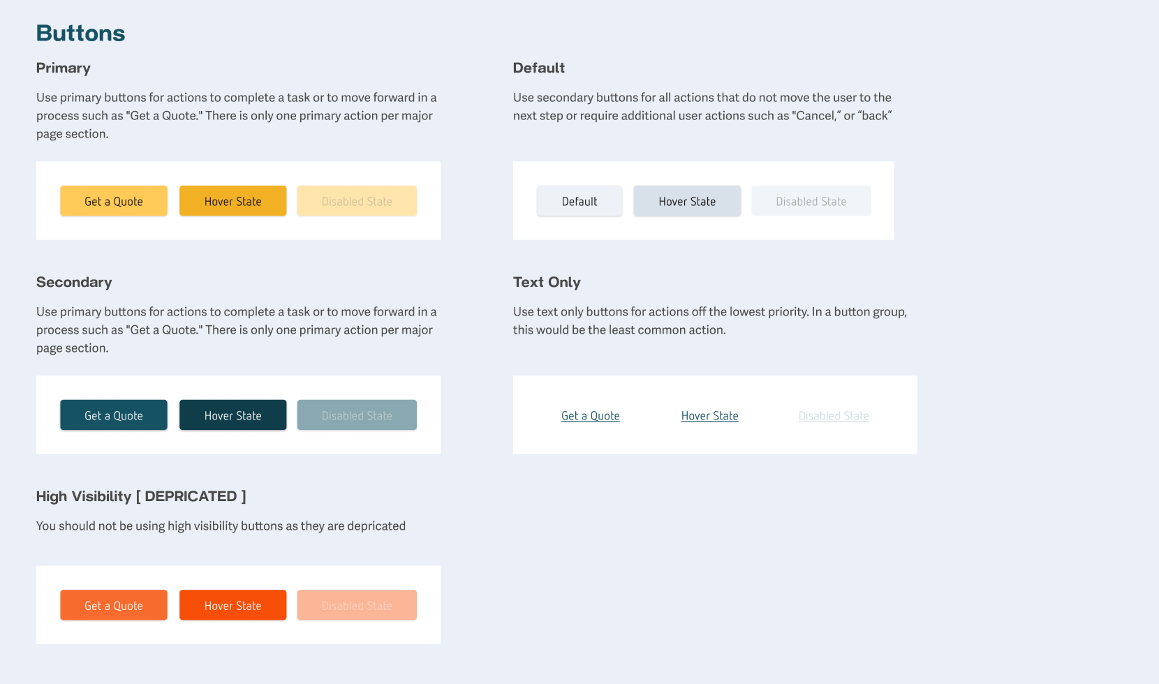
The initial phase of this project was auditing the entire user journey, , mapping all the color styles, text styles, spacings, shadows and components we were using across all screens. Throughout the audit process, I grouped similar components to understand how many versions of each type of component we had. For instance, I found out that we were using at least 7 different button styles across the user flow.
After the audit and grouping phase, I had a clear understanding of the opportunities I had to converge different treatments for the same component into a more minimal set.

Collaboration
After the the components housekeeping was done, it was time to understand how I should organize the system so designers would actually enjoy using it. Then, a lot of tooling questions came into place - Should we use components properties or variants? How many levels of artifacts should the system have? And many others.
To get to the answers, I had some sessions with the designers, product managers and even marketing managers understanding their preferred way to use it, and I finished to create all the components and the library in Figma accordingly.
Handover
Lastly, I worked with Engineering to prepare a handover documentation and prioritize the development of the components for use in production. As we had a single engineer, we defined a plan of shipping first minimal but impactful elements, the primitives ones (color styles, text styles and atomic components like buttons). This would give us a huge impact on making the experience for users consistent, while we’re shipping other batches of components in a slower cadence.
Initial release
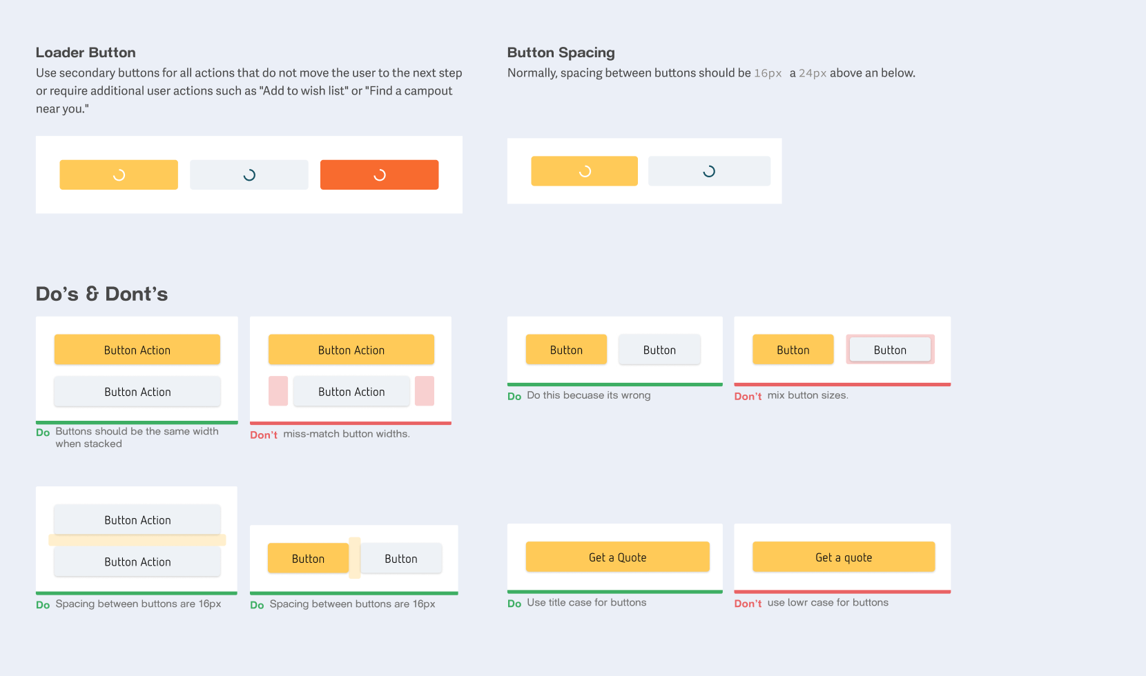
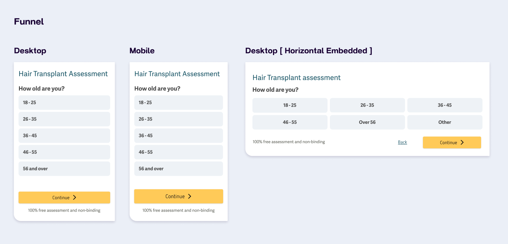
Here is a portion of the initially released components that could be leveraged during development of the platform.


Results
Until end of 2022, I was also in charge of maintaining the system while working on other projects, updating and creating new components to attend the product and user needs. The system continues active and being used daily by the team, receiving lots of positive feedbacks.